Design
Apr 1, 2026
The Casual Assassin: Marathon UI/UX
PvP anxiety aside. Marathon somehow feels like getting shot at inside a really lux design system. Which, unfortunately, is just my thing. [insert crying smiley face here]
Category
Design
Reading Time
5 Min
Date
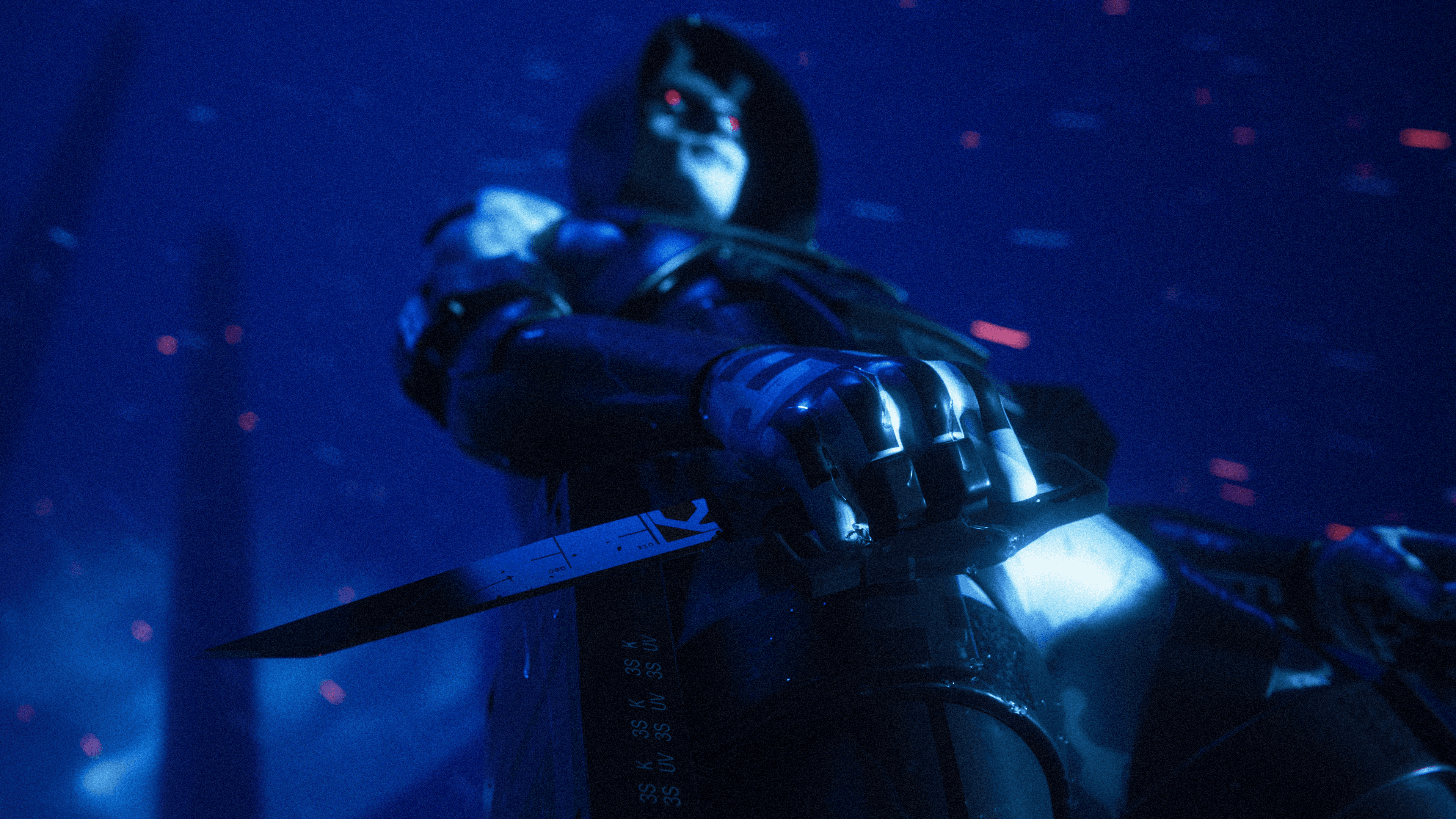
Everything Looks Utterly Sexy
The UI def feels like it was designed by someone with insomnia and excellent taste.
Killer type. Sweet delightful micro worlds. Brutalist menu moments. Colors that should not work together but absolutely do. Everything hits my dopamine receptors just right. I cry.
A lot of games want to feel cinematic. Marathon feels graphic.
The CRT textures? The motion blur? The great interface layering? Yeah. Someone on that team cares deeply about micro details. [Marry me].
Meanwhile, Here I Am Fighting For My Life
Every prox chat interaction starts with someone assuming I’m a dude until I speak. Then there’s always that brief moment of confusion like women existing in PvP is somehow still breaking news in 2026.
Relax. I’m stressed too.
I’m not even pretending to be some elite extraction shooter player. Half the match is me admiring lighting and accidentally running directly into danger because I saw a cool hallway.
But honestly? The panic is part of the charm, part of the rush.
Rare Game With Actual Taste
Most modern UI gets flattened into “clean.” Which usually just means forgettable.
This doesn’t feel safe enough for that.
Everything in Marathon has a point of view. The character design, the sound cues, the typography, the color palette… it all feels obsessive in a good kinda way.
Dig that energy. More games should feel a little harder to explain.
P.S. For the love of God, Bungie, please just add a training simulator already. Help me build up some confidence.
This is unghost.exe signing off…
Related Articles